Squaw Valley Adventure

My Photo
Name:
Location: United States

if a life well-lived is a work of art, then I'm still just sketching a draft.

Saturday, September 30, 2006

The house takes shape - finally!

Here is the new design for our house! This time, I think we finally got it... What was wrong with the old design (posted earlier)? Well, by the time we factored in all of the County setback requirements, it just didn't look like it would fit on the pad. I actually measured and laid out the house on site, and there were a couple of corners that were well beyond the setback from the ascending and descending slopes - one corner was down off the edge of the pad! So then we decided it was time to go back to the drawing board - again...

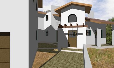
And now here's what we've come up with. Below is a view from the driveway as you approach the house, looking northwest; the walls are supposed to be off-white:

The floor plan layout is still an L-shape, but now it's flipped around so that it creates a broad, open terrace facing southeast (the best view to and from this pad!). The rooms were re-positioned according to where we wanted them in relation to the pad, the views and the solar exposure. The most public spaces are still up front, and the most private spaces are still in back, but they are much more in harmony with the site and the way we will live in this house. Here is the plan for the main levels:

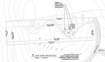
And here is the plan for the upper levels: The biggest change is the location of the garage. Despite my most creative efforts, it just would not fit within the same pad as the house. So I moved it to what was going to be a garden/greenhouse area, where there just happened to be enough room for the garage to fit without too much earthwork. The northwest wall will need to be a retaining wall for about the first 2 feet or so, which means we lose the door on this side. The only way to enter the garage is through the overhead doors, or through the restroom. There's still a large area left for our vegetable garden.


In the meantime, we have hired a land surveyor to do a topographic survey of the driveway and pad, so that I can prepare the grading and drainage plan that the County requires for the building permit. I thought I would also need to hire a geotechnical engineer to do a soils analysis, but it turns out the County does not require this for the permit.

The next step is for me to get the drawings detailed enough for the structural engineer(s) to start their design/drawings. Then I will know what changes (if any) I need to make to finalize the design and begin producing the construction documents for the building permit. That process will involve creating all the architectural, HVAC, plumbing and electrical drawings for our house, most of which I plan to do myself. My goal is to have a set of plans ready to submit to the County by Thanksgiving, but that depends on my stamina! Pray for me.... and for Libby as she copes with living in an apartment that is too small for 2 rambunctious little boys!

Sunday, July 30, 2006

The House Takes Shape - part 2

Here is a series of images around the outside of the house... These show a 3D model of the house that I built in a CAD program called VectorWorks. I have only been using this program for about 10 months, but I think I have it figured out now. So, not only have I been trying to come up with a site-specific design for our new home, but I have also been trying to learn how to use the 3D tools of this CAD program. This has called for several all-nighters at the office during the past few weeks!

Anyway, we're pretty excited with the results... As you view these images, you will probably think they look a bit sparse, so you have to use a little imagination - try to view these with nice mature landscaping: add some clematis on the trellis above the front door; some wisteria trailing down from the 2nd-story trellises; some window boxes full of blooming flowers; some large potted plants and bistro tables scattered around the courtyard; a fruit tree on an espalier on the blank garage wall facing the front door.

Here is a view of the front, as you approach the house from the driveway:


Here is a view of the main entry tower, as you approach from the driveway:
Here is a view of the courtyard, from the front porch:
Here is another view of the courtyard, from the under the bridge between the house and garage:
Here is a view of the northwest corner, from above, up on the hill behind the house:
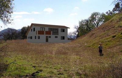
And here is a view of the backyard, from the just north of the property line:
In this last photo, the north property line is actually right about where Caspian is! When I took this photo, I was standing just south of the barbed wire fence. In making the adjustment for the actual property line location, and complying with the 60-ft setback rule, we end up with a backyard that is about 50x100 ft of open level sheltered area. Perfect for the boys' playground!


Also, keep in mind that this isn't the final design... I have quite a few adjustments to make to the window sizes and locations, to the roof heights and overhangs, to get the proportions just right. There is a reason why some houses look better than others, and it is due to the designer's awareness of and skillful application of proportional geometries and regulating lines. I have been greatly inspired by two recent works that have been publishes about these subjects:


- one is a book titled "The Old Way of Seeing", by Jonathan Hale, who attempts to explain why some very old works of architecture are much better than some very recent works. And it isn't about traditional vs. modern styles - instead, it's about the deep sense of intuition and craft that the designers of old had as they approached their work.


- the other is a website put up by Christopher Alexander, a contemporary architect whose work I greatly admire, where he also explains why some works of architecture are better than others. He has spent the past several decades discovering and testing fifteen properties that contribute to what he calls "life" in the built environment.


Together, these and other works have educated my senses to a deeper level of architectural appreciation. And it isn't just about making our house merely "look" better - instead, it's really all about making our house "live" better. I've always known that architecture has the power to influence our lives, it's just that I never really took the time to understand how. Nor have I ever really been critical of the difference between the good and the bad influences that architecture has - until first I came to know God and the deep beauty of His creation, and second until I cast aside my way of seeing things and began to see things His way. I still have a lot to learn, but I don't want to miss using our house as an opportunity to learn more about His ways, both in the process of creating it and in the process of living in it. That, ultimately, is what great architecture is supposed to do: inspire and instruct us by its depth of truth, beauty and goodness to live our lives with deeper truth, beauty and goodness. And who else but the Lord of lords is more beautiful, more true and more good???

Saturday, July 29, 2006

The House takes Shape!

We began the design of our home with the assumption that the existing barbed wire fence on the north side was our property line. We measured the required 60-ft setback from that fence, and determined that we could have a long, linear layout. My design began with a detached garage, with a courtyard between it and the house, and a trellised walkway tying these all together. It was a simple, functional design, but not especially dynamic architecturally.

Then we hired a land surveyor to mark the property lines. We arrived on site about a week after he had set the stakes, and as I walked onto the house pad I noticed one stake was a long way from the fence, about where the boy's bedrooms were to be located in my house design. Suddenly I had severe difficulty breathing as I assessed the amount of buildable area we were left with. As my chest tightened and I thought I was headed for a heart attack on the spot, I resolved to investigate the matter later when I had more facts.

Well, now the facts speak for themselves: see the image below. This is an overlay of the property lines on an aerial photo of our parcel: the boundaries are the blue dash-dot-dot lines, the required zoning setbacks are the light blue dash-dot lines, and the existing barbed wire fence is the yellow dashed line. As you can see, the fence runs as much as 60 feet north of our property line! The good news is, this is an extra 1/2-acre of land that is pretty much ours to enjoy; the bad news is, there's not much of a pad left to build our house on!

So it was back to the drawing board, to come up with a totally new design, and soon! Below is the design solution that I came up with: the concept for the house is a 40x40-ft square, with a 20x20 quadrant that spins out and becomes the garage, leaving an irregular-shaped courtyard between it and the house. With an L-shaped house, I had the opportunity to put the public spaces in one leg and the private spaces in the other, and to position the stair tower in the corner of the L, kind of like a pivot or hinge point. The more I developed this design and discussed it with Libby, the more we both began to see how the limitation of the survey was resulting in an opportunity for a really unique, livable home.

Below are the floor plans: it's a 2-story, with our bedroom upstairs in the private leg of the L. The great room faces east and also a bit west into the courtyard, which will be shaded most of the day by the detached garage, which is also 2-story. My office/studio will be above the garage, and I wanted a way to get to it without going downstairs, outside, and back upstairs. So I designed a bridge connecting the 2nd floors, providing direct access in a fun and unique way. The bridge will also provide more shade on the courtyard in the warm afternoons.

Overall, the house turned out to be about 2096sf total (gross), and the garage/office is about 1038sf total (gross), for a grand total of about 2688sf of habitable space (not including the garage). That's a lot of house for what we thought was not much buildable area! That's what architecture does: it turns a problem into an opportunity for better design and more area.

Monday, July 17, 2006

Welcome!

This blog was created to keep our friends and family updated on our building project, and to share our homebuilding experiences with anyone else out there who's interested. The internet is a powerful tool for expanding one's awareness of new technologies, but it can be overwhelming. That's where a good blog can bring it all together in a way that is up-to-date and specific to one's interests.

We recently purchased a five acre parcel of land in Squaw Valley. It has a driveway and a couple of building pads that were graded in the '80s when the parcel was created, but that's it - no utilities, not even power.

We are currently debating the pros and cons of power sources: whether to have the local utility bring power to our site, or to remain off the grid and use solar. We are finding that the cost will be about the same either way: the local utility charges about $18/LF to run power poles (and the nearest pole is about 1/4 mi. away), while most solar power systems run about $8k to as much as $12k per kW installed (and we would need about 2.5kW to run our house).

We are also researching our options for the other utilities: water (well), sewer (mini-treatment plant) and gas (underground propane tank).

What our land does have is great scenic value and exciting development potential. The rugged terrain and oak woodland are pretty (especially in spring), and the view from the top of our hill is stunning (on a clear day you can see the Coast Range across the Central Valley).

As of this date, we are planning to build our house with non-combustible materials: autoclaved aerated concrete block (AAC) will be used for all exterior walls, while metal framing will be used for the interior, and fiber-cement tiles on the roof. We believe that anyone who builds in the CA foothills should build a FireWise house. The only combustible materials in our home will be interior finishes. It just doesn't make sense to us to take a beautiful piece of Douglas Fir lumber, mill it into a lowly stud and hide it inside a wall!

Future posts to this blog will include some images of the custom home we are currently designing for the site, along with details about the architecture and construction. Stay tuned!